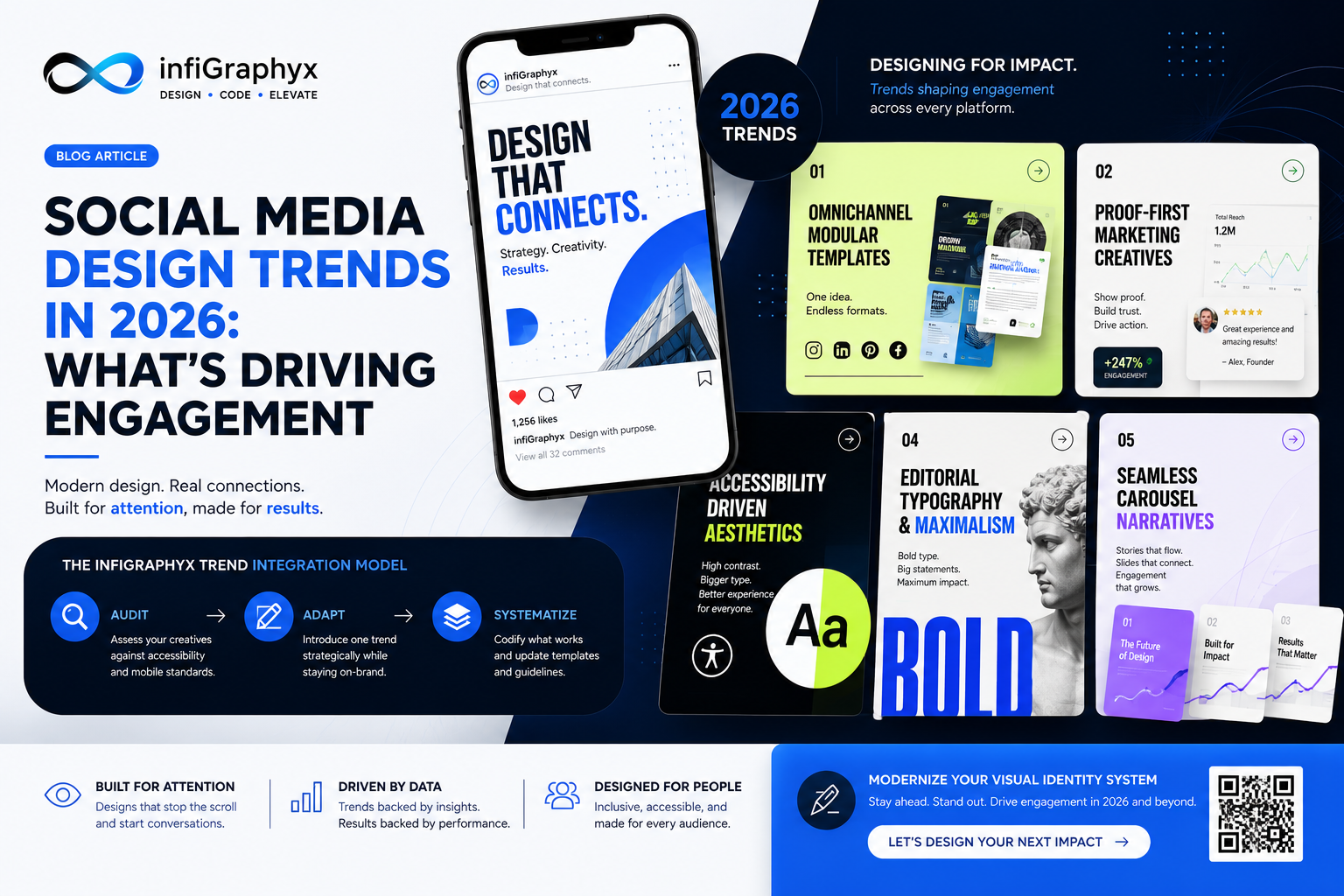
Quick Summary & Key Takeaways
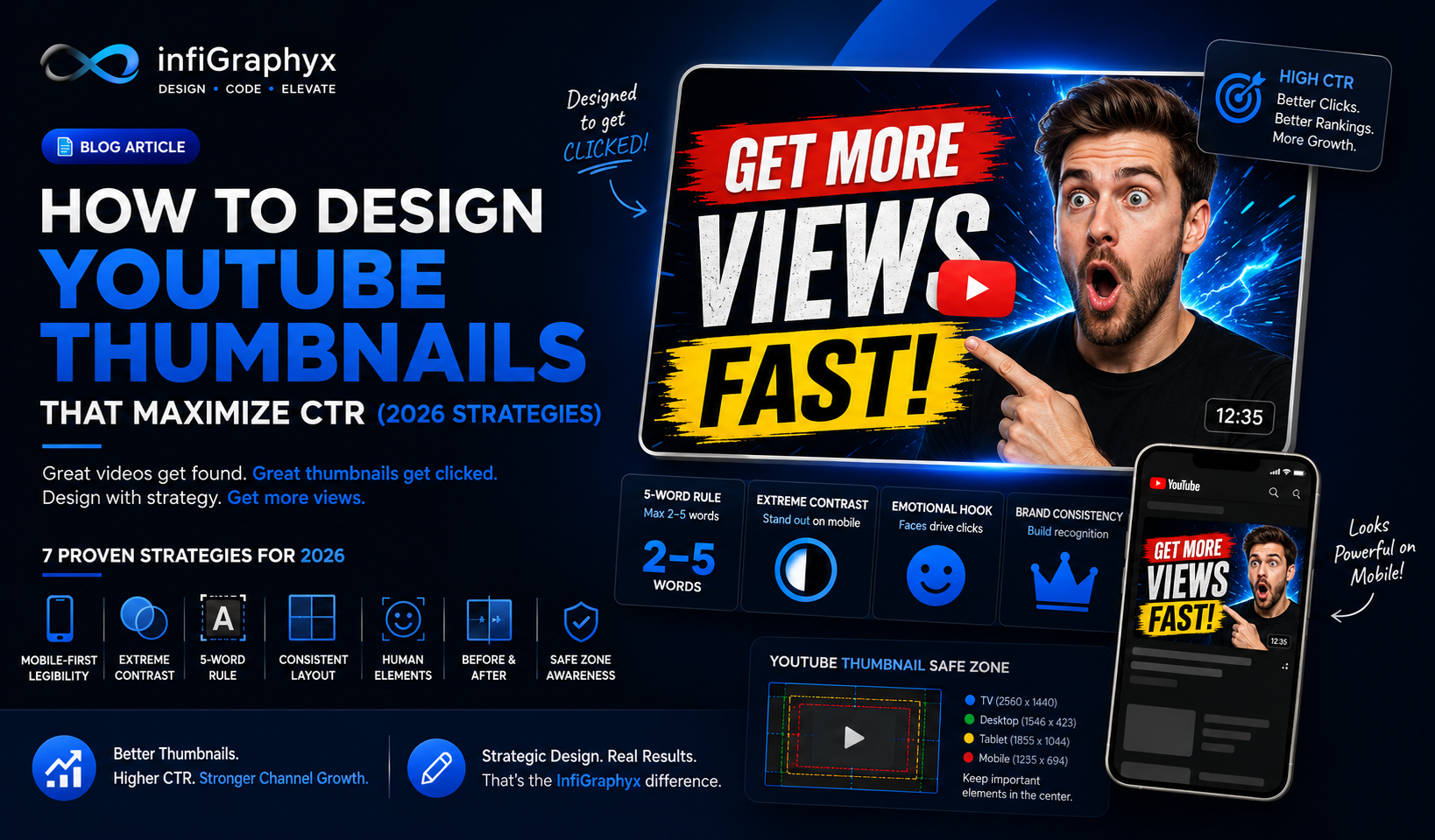
- The 5-Word Rule: To optimize YouTube thumbnail design for a higher Click-Through Rate (CTR), restrict text to 2–5 highly emotive, oversized words.
- Extreme Contrast: Utilize deep drop shadows and striking background separation to make the focal subject instantly recognizable on mobile screens.
- Complementary Copy: A successful thumbnail visually fulfills the core promise of the video title without repeating the title identically, creating a powerful curiosity gap.
- Consistent Visual Identity: Building a proprietary channel aesthetic ensures instant brand recall, increasing baseline views from returning subscribers.
What Is YouTube Thumbnail Optimization?
YouTube thumbnail optimization is the specialized practice of designing custom video cover graphics engineered specifically to maximize Click-Through Rates (CTR). In content marketing, a thumbnail is not mere decoration; it is the single most critical asset that dictates whether a video gains algorithmic traction or dies in obscurity. Proper design blends graphic design principles with psychological hooks.
Why Is YouTube Thumbnail Design Crucial for Channel Growth?
In the highly competitive YouTube ecosystem, video production quality is entirely irrelevant if the viewer never clicks. High-performing thumbnails arrest the scroll, drive immediate brand awareness, and boost overall channel conversion rates. Industry standards indicate that establishing a recognizable visual identity in your thumbnails builds customer trust, leading to higher baseline return-viewer metrics and sustained organic growth.
The InfiGraphyx Thumbnail CTR Blueprint
To consistently generate high-converting YouTube assets, implement the proprietary InfiGraphyx Thumbnail CTR Blueprint:
- The Visual Hook (The Face/Object): The central image must display high emotion or extreme intrigue. Subjects should be meticulously cut out and separated from the background using lighting effects.
- The Semantic Hook (The Text): 2 to 5 words placed strategically in the safe zones, utilizing heavy, high-contrast, sans-serif typography.
- The Aesthetic Anchor (Brand Identity): The consistent use of a designated primary brand color, specific borders, or recurring visual motifs.
7 Proven YouTube Thumbnail Strategies for 2026
1. Mobile-First Legibility is Non-Negotiable
Over 70% of YouTube consumption occurs on mobile devices. Design your canvas at 1920x1080, but zoom out to 10% to test for legibility. If the core emotion and text are not readable at the size of a postage stamp, the design has failed.
2. Establish Extreme Foreground/Background Contrast
Use depth of field (background blur), bold outer glows, or distinct color blocking to separate your main subject from the background. Avoid complex, noisy backgrounds that dilute the focal point.
3. Implement the 5-Word Typography Rule
Thumbnail text should complement the video title, generating a curiosity gap. Use heavy, sans-serif typefaces (like Impact, Montserrat Black, or custom fonts) with high-contrast outlines.
4. Systematize Your Layout Architecture
Develop a repeatable layout architecture (e.g., human subject on the right, text left-aligned in the negative space). This trains the algorithm and audience to recognize your content instantly.
5. Leverage Human Elements Strategically
Faces drive clicks, but only when exhibiting genuine, context-appropriate emotion. Ensure the subject's eyeline directs the viewer toward the text, utilizing the psychological principle of "gaze cueing."
6. The "Before & After" Concept
Visualizing a transformation creates an irresistible hook. Split-screen designs showing a baseline versus a desired outcome consistently generate exceptional CTRs.
7. Respect the YouTube UI Safe Zones
Never place critical text or visual information in the bottom right corner, as it will be entirely obscured by YouTube's native timestamp overlay. Maintain safe margins around the entire perimeter.
Expert Insight
Thumbnail optimization requires rigorous A/B testing utilizing YouTube Studio's native features. Monitor CTR, but critically correlate it with Average View Duration (AVD). Clickbait thumbnails that misrepresent content will yield high initial clicks but result in massive viewer drop-off, permanently destroying retention metrics.
Common Mistakes in Thumbnail Design
- Ignoring UI Safe Zones: Placing critical text where the timestamp overlay sits.
- Cluttered Backgrounds: Using noisy imagery that dilutes the focal point.
- Clickbait Misalignment: Designing thumbnails that misrepresent the video content, eroding trust.
Scale Your Channel with Professional Design Services
Outsourcing visual packaging is a massive ROI driver for creators. Professional graphic design services deliver high-converting, brand-aligned assets. To upgrade your channel's strategy, explore custom design solutions with InfiGraphyx today.
infiGraphyx Team
The infiGraphyx team consists of talented designers and creative professionals passionate about helping brands succeed through stunning visual content.